How to Make a Line Graph in Excel (Four Clicks)
Select your data, open the Insert tab, click Insert Line or Area Chart and pick a 2-D Line thumbnail. Here is the full path, the faster routes, and when a scatter chart is the better call.
 By Daniel ShuttleworthOct 4, 2026
Select your data including the column headings, open the Insert tab, click Insert Line or Area Chart in the Charts group, and choose the first thumbnail under 2-D Line. Excel drops a line chart onto the same worksheet, ready to retitle and label.
That is how to make a line graph in excel in its shortest form, and the path is the same in Excel for Windows, Excel for Mac and Excel for the web. The part worth understanding before you click is what Excel assumes about the bottom of your chart.
A line chart spaces your category labels evenly along the horizontal axis, whatever those labels actually say. Twelve months, twelve rows, twelve equal gaps. Microsoft's guidance is that this is the right chart when you have text labels at even intervals and continuous data over time. If your x values are numbers at uneven intervals — readings at 0, 5, 40 and 300 seconds — Excel will still space them evenly, and the shape of your line will mislead you. That case wants a scatter chart instead.
How to make a line graph in Excel, step by step
1. Lay the data out in two adjacent columns, with one header row: the labels on the left, the numbers on the right. Excel charts whatever is in the cells, so tidy it first — if your labels are crammed into one column, split them apart before you chart anything.
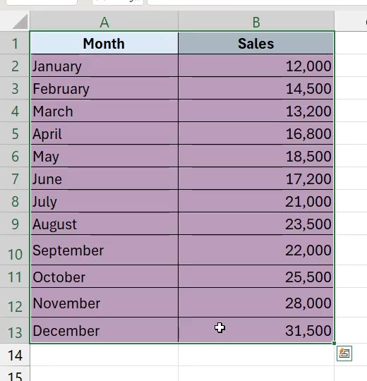
2. Select the whole block, headers included, then open the Insert tab. The chart buttons sit in the Charts group, in the middle of the ribbon.

3. Click Insert Line or Area Chart — the small icon showing a jagged line. The menu splits into 2-D Line, 3-D Line, 2-D Area and 3-D Area, with More Line Charts… at the bottom. Take the first thumbnail under 2-D Line for a plain line. The one with dots on it is Line with Markers, which is worth using when you have few enough points that each one matters.
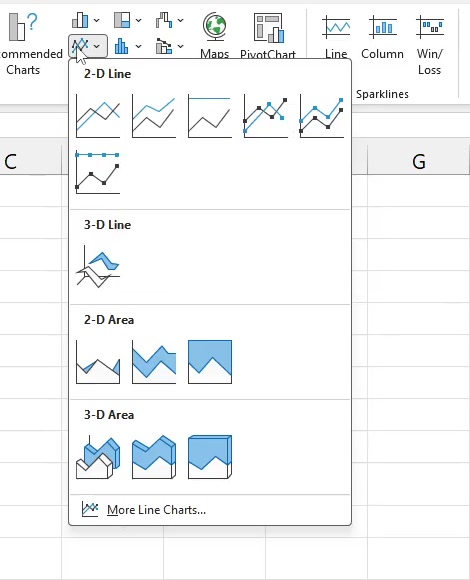
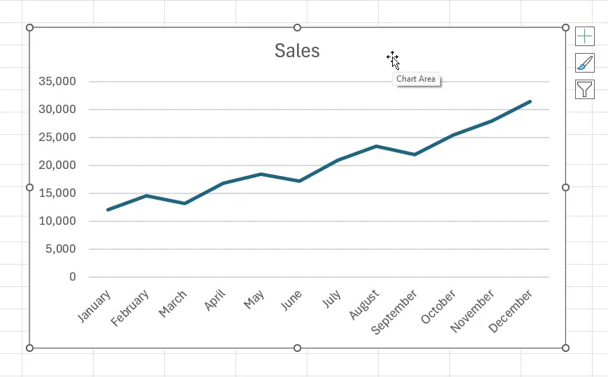
4. The chart lands on the same worksheet. Excel takes the chart title from your value column's header, so a column headed Sales gives you a chart titled Sales. The three buttons down the right-hand edge are Chart Elements, Chart Styles and Chart Filters.
Label it before you send it to anyone
A chart with no axis titles makes the reader guess at the units. Select the chart and the Chart Design tab appears on the ribbon. Go to Add Chart Element > Axis Titles and pick Primary Horizontal or Primary Vertical, then type over the placeholder.
Quick Layout, on the same tab, applies a preset combination of titles, labels and legend in one click if you would rather not add elements one at a time. The Chart Elements button — the plus sign beside the chart — does the same job from a checklist.

Faster routes, and what changes on Mac and the web
If you are not sure a line is the right shape for your data, use Insert > Recommended Charts instead. Excel reads your selection and proposes chart types on the Recommended Charts tab, with a preview of each; the All Charts tab lists every type if none of the suggestions fit. Click OK to insert. On Windows, Alt then N then R opens that dialog from the keyboard.
Two shortcuts skip the menus entirely. With your data selected, Alt+F1 creates a chart on the active worksheet and F11 creates one on its own chart sheet. Both use your default chart type rather than asking, so they are quick rather than precise.
Excel for Mac uses the same Insert tab and the same Chart Design tab, with Add Chart Element, Quick Layout, Switch Row/Column, Select Data, Change Chart Type and Move Chart in the same places. Excel for the web follows the same Recommended Charts path. The screenshots above are Excel for Windows, so your ribbon icons may be arranged slightly differently, but the names match.
What a line graph will not do
It will not fix an uneven horizontal axis. Line charts distribute categories evenly no matter what the values are; only a scatter chart treats the horizontal axis as a real number line, which is also what you need for a logarithmic horizontal scale or for comparing a large number of points without regard to time.
It will not reorder your rows. The line follows your data in sheet order, so if your months are out of sequence the chart will be too. Sort the range first. With a long column it helps to keep the header row frozen while you check the order.
And 3-D Line and the Area types in that same menu are not decorated versions of the same chart. Area charts fill the space under the line, which changes what the reader takes away — stacked area in particular reads as parts of a total, not as separate series.
Common questions
How do I add a second line? Put the second set of numbers in a column beside the first, select all three columns, and insert the chart the same way. For a chart that already exists, Select Data on the Chart Design tab lets you add the series without starting over.
My labels ended up on the wrong axis. Switch Row/Column, on the Chart Design tab, flips which direction Excel reads as categories and which as series. It is one click and reversible.
Can I move the chart to its own sheet? Yes — Move Chart on the Chart Design tab does it after the fact, and F11 does it at creation time.
If the option isn't there
The usual cause is the selection: if no cells are selected, or the selection holds no numbers, the chart buttons have nothing to work with. Click into the data block and try again.
On older releases of Excel the plus-sign Chart Elements button may not appear at all. The Chart Design tab route — Add Chart Element, then Axis Titles — works across versions, so use that when the button is missing rather than assuming the feature was removed. And if the Line thumbnails are not where you expect them, Insert > Recommended Charts > All Charts reaches every chart type Excel can make, line charts included.